When I took the CIS 9655 Data Visualization class at Baruch College, my professor used the popular data visualization book Storytelling with Data as our textbook. Knaflic, the author of the book, worked as People Analytics Manager at Google from 2007 to 2013; she subsequently founded the company storytelling with data and published the corresponding book in 2015. I was inspired by many concepts introduced in this book, and I cannot wait to share some of my key takeaways with you.
(Please note: All the images used in this article are directly screenshotted from the book.)
1. Minimal Borders for Tables

Screenshot of Figure 2.4 Table Borders (p.92-93)
If you need to use a table, it is best to remove any shading or thick borders from the table, as this distracts the audience from the most important element—the data.
2. Use a Heatmap for Data Table Comparison
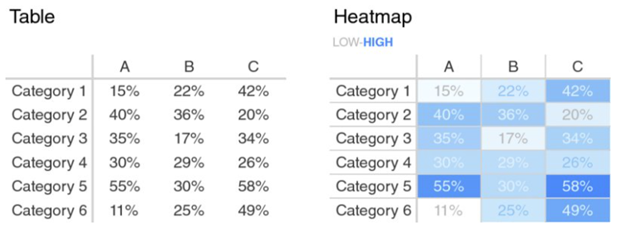
Screenshot of Figure 2.5 Two views of the same data (p.94-95)
When you need to compare data within a table, it is best to use a heatmap. But do not forget to label which color indicates a low value and which color indicates a high value. In the example shown above, it is easy to tell, but sometimes it’s difficult to tell when the color palettes used are not from a lighter to a darker shade.
3. Always Show a Zero Baseline in a Bar Chart
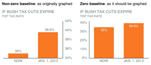
Screenshot of Figure 2.13 Bar charts must have a zero baseline (p.110-111)
It can be misleading if the bar chart does not start from zero.
4. Use Right Width for Each Bar

Screenshot of Figure 2.14 Bar width (p.114-115)
Each bar should be wider than the space next to it but not too wide.
5. Do Not Use Secondary Y-axes
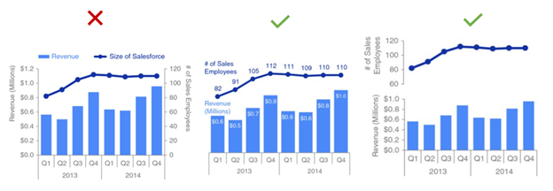
Screenshot of Figure 2.26 Secondary y-axis and Figure 2.27 Strategies for avoiding a secondary y-axis (p.138-139)
Using y-axes on both sides of a graph can be confusing. Instead, you can remove both y-axes and use data labels; or you can use two y-axes: one y-axis is on top of the other one.
6. Highlight with Different Colors
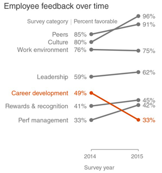
Screenshot of Figure 2.11 Modified slope graph (p.106-107)
If you want to highlight a certain element, you can use a different color to draw viewers’ attention.
7. If You Only Have One or Two Numbers, Use Text Directly
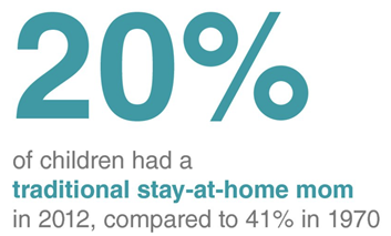
Screenshot of Figure 2.3 Stay-at-home moms simple text makeover (p.90-91)
As the screenshot shows above, if you want to emphasize certain numbers, the text itself can act as a chart, as you can bold or color numbers that you want to convey more strongly.
8. Do Not Use a Pie Chart or Donut Chart to Compare
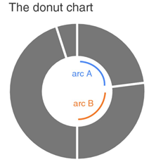
Screenshot of Figure 2.24 Donut chart (p.134-135)
As the screenshot shows above, it’s hard to compare items that have comparable values using a Pie Chart or Donut Chart because they are too similar in size.
9. Remove Clutter
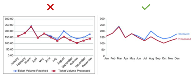
Screenshot of Figure 3.24 Before-and-after (p.184-185)
When you are done with your data visualization, go back and see what you can remove from the chart without affecting the meaning you want to convey. In Knaflic’s words, “Remove chart border; Remove gridlines; Remove data markers; Clean up axis labels; Label data directly; Leverage consistent color” (p.176-181). This is all part of removing clutter from your data visualization.
10. Annotation and Text Are Your Friends
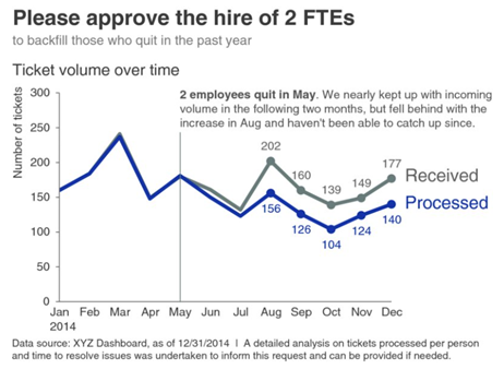
Screenshot of Figure 5.10 Add action title and annotation (p.258-259)
Annotation helps viewers understand additional information needed to better decipher the graph. Additionally, the title text reminds the viewers of the key messages behind the chart.
11. “Good Data Visualization Tells a Story”
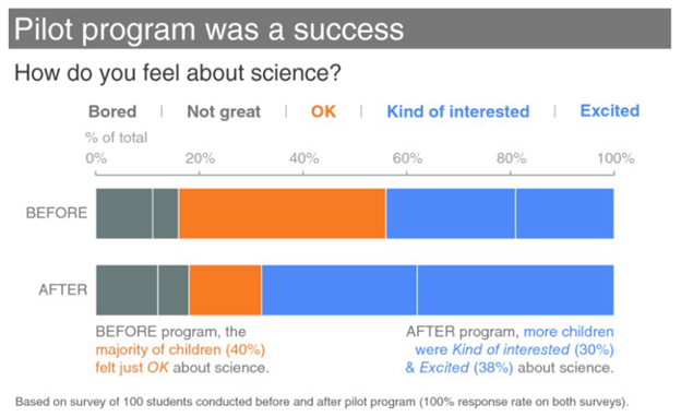
Screenshot of Figure 9.31 100% stacked horizontal bar graph (p.402-403)
The use of different colors, a key message title, and descriptive annotations convey a clear story.
As Knaflic suggested at the end of her book, we should seek inspiration from good examples and reflect on what makes those data visualizations effective. Below are some data visualization websites recommended in the book to help inspire you.
https://www.storytellingwithdata.comhttps://www.vizwiz.com
https://flowingdata.com
Knaflic, C. N. (2015). Storytelling with data: a data visualization guide for business professionals. Hoboken, New Jersey: John Wiley & Sons, Inc.